Client-side Layouting
We distinguish between micro and macro layout. Usually, the server is responsible for the macro layout, that is the arrangement of the main model elements (i.e. nodes and edges). This layout is defined already in the graphical model by means of coordinates. In turn, the client is responsible for the micro layout, that is the positioning and size computation of elements within a container element such as nodes. The client side (i.e. micro) layout can be configured in the graphical model, but will be applied on the client during the rendering phase.
Layout Container
Graphical elements that support client-side layouting of contained elements offer a layout property which defines the type of layouter that should be used.
In addition, the behavior of the layouter can be configured with a set of layout options.
For an example let’s have a look at the following GNode:
Java GLSP Server
new GNodeBuilder()
   .layout(GConstants.Layout.VBOX)
   .layoutOptions(new GLayoutOptions()
      .hAlign(GConstants.HAlign.Center))
   .add(new GLabelBuilder()
      .text("label1")
      .build())
   .add(new GLabelBuilder()
      .text("label2")
      .build())
   .build();
Node GLSP Server
GNode.builder()
  .layout("vbox")
  .addLayoutOption("hAlign", "center")
  .add(GLabel.builder().text("label1").build())
  .add(GLabel.builder().text("label2").build())
  .build();
This node contains two label elements that should be layouted vertically (from top to bottom) using the vbox layouter.
In addition, we specify options for that layouter by defining that the children should be centered horizontally.
Layout Options
To adapt the chosen Layout (for more details please see below), the default Layout options AbstractLayoutOptions allow to configure:
resizeContainer: booleanIndicates, if the container is resizable depending on its children (e.g.trueforhboxlayout)paddingTop: numberSets the height of the padding area on the top of an element to be positioned in pixel.paddingBottom: numberSets the height of the padding area on the bottom of an element to be positioned in pixel.paddingLeft: numberSets the height of the padding area to the left of an element to be positioned in pixel.paddingRight: numberSets the height of the padding area to the right of an element to be positioned in pixel.paddingFactor: numberDefines the multiplication factor for an element’s size, which is then added as padding space around this element. E.g. For thestacklayout1does not add additional padding to the element,2doubles the padding area around the element by its size.minWidth: numberDefines the minimum width of an element to be positioned.minHeight: numberDefines the minimum height of an element to be positioned.
Usage Java GLSP Server
To use the Layout options on the GLSP Java Server, there are several utility classes for option keys and values, for example:
- Edge label placement
GConstants.EdgeSide:LEFT|RIGHT|TOP|BOTTOM|ON - Horizontal alignment
GConstants.HAlign:LEFT|CENTER|RIGHT
For more details, please see GLayoutOptions
and GConstants.
Usage Node GLSP Server
To use the Layout options on the GLSP Node Server, the support via utility classes for option keys and values is currently very limited, e.g. only the EdgeSide type is available.
Therefore please use the dedicated string values in the meantime, e.g. "hAlign" "center" and so on.
Default GLSP Layouters
In general, layouters can be applied to elements that are compartments, in order to layout the containers based on the sizes of their children.
There are three built-in layout types that can be used: hbox, vbox and freeform.
hbox Layout
The HBoxLayouterExt layouts children of a container in a horizontal (left to right) direction.
This layouter provides additional layout options via HBoxLayoutOptionsExt:
hGap: numberDefines a horizontal gap between elements in the same container in pixel.vAlign: VAlignment = ‘top’ | ‘center’ | ‘bottom’Defines the vertical alignment of the element to be positioned.hGrab: booleanIndicates whether the remaining horizontal size can be grabbed by its children.vGrab: booleanIndicates whether the remaining vertical size can be grabbed by its children.prefWidth: number | nullDefines the preferred width of the container element, which will be assigned, if there is no manually specified width and the sizes of its children aren’t requiring a larger width to fit into the container.prefHeight: number | nullDefines the preferred height of the container element, which will be assigned, if there is no manually specified height and the sizes of its children aren’t requiring a larger height to fit into the container.
According to the layout options, the children of the container are layouted and as concluding step, the final bounds of the container are computed based on the sum of this children bounds.
hbox Layout Example
This example creates a compartment of the default type DefaultTypes.COMPARTMENT using the hbox layout.
It adds two children, one icon compartment (with custom type "icon") and one label.
The layout options define a horizontal gap of 15 pixel between the children of the compartment.
Java GLSP Server
   new GCompartmentBuilder()
         .type(DefaultTypes.COMPARTMENT)
         .layout(GConstants.Layout.HBOX)
         .layoutOptions(new GLayoutOptions().hGap(15))
         .add(new GCompartmentBuilder()
            .type("icon")
            .build())
         .add(new GLabelBuilder()
            .text("label")
            .build())
         .build();
   .build();
Node GLSP Server
GCompartment.builder()
  .type("comp")
  .layout("hbox")
  .addLayoutOption("hGap", 15)
  .add(GCompartment.builder().type("icon").build())
  .add(GLabel.builder().text("label").build())
  .build();
On the client side, we need to configure (besides the default elements GCompartment and GLabel) a custom Icon element and a IconView like this: configureModelElement(context, 'icon', Icon, IconView).
The Icon element definition and the IconView definition are taken from the workflow example.
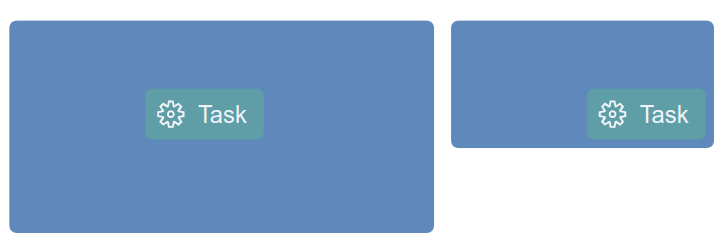
The resulting element with the obvious horizontal gap between the child elements is shown in the following image:

Using no `hGap` layout option (left) or `hGap` layout option with 15 pixel (right)
vbox Layout
The VBoxLayouterExt layouts children of a container in a vertical (top to bottom) direction.
This layouter provides additional layout options via VBoxLayoutOptionsExt:
vGap: numberDefines a vertical gap between elements in the same container in pixel.hAlign: HAlignment = ‘left’ | ‘center’ | ‘right’Defines the horizontal alignment of the element to be positioned.hGrab: booleanIndicates whether the remaining horizontal size can be grabbed by its children.vGrab: booleanIndicates whether the remaining vertical size can be grabbed by its children.prefWidth: number | nullDefines the preferred width of the container element, which will be assigned, if there is no manually specified width and the sizes of its children aren’t requiring a larger width to fit into the container.prefHeight: number | nullDefines the preferred height of the container element, which will be assigned, if there is no manually specified height and the sizes of its children aren’t requiring a larger height to fit into the container.
According to the layout options, the children of the container are layouted and as concluding step, the final bounds of the container are computed based on the sum of this children bounds.
vbox Layout Example
This example creates a compartment of the default type DefaultTypes.COMPARTMENT using the vbox layout.
It adds two children labels, which are positioned vertically from top to bottom and are centered horizontally.
Java GLSP Server
   new GCompartmentBuilder()
         .type(DefaultTypes.COMPARTMENT)
         .layout(GConstants.Layout.VBOX)
         .layoutOptions(new GLayoutOptions().hAlign(GConstants.HAlign.CENTER))
         .add(new GCompartmentBuilder()
            .type("icon")
            .build())
         .add(new GLabelBuilder()
            .text("Label")
            .build())
         .build();
   .build();
Node GLSP Server
GCompartment.builder()
  .type("comp")
  .layout("vbox")
  .addLayoutOption("hAlign", "center")
  .add(GCompartment.builder().type("icon").build())
  .add(GLabel.builder().text("Label").build())
  .build();
On the client side, we use again the Icon element definition and IconView, please see section hbox Layout Example.
The resulting element positions its children vertically from top to bottom and aligns each element horizontally, this is shown in the following image:

Center children horizontally (left image) or align children to the left (right image)
freeform Layout
The FreeFormLayouter positions the children of a container according to their explicit, parent-relative x/y coordinates inside the parent container.
This layouter uses the default Layout Options and provides suitable default values (e.g. resizeContainer: true).
Again here, the children of the container are positioned according to their explicit positions inside the container and as concluding step, the final bounds of the container are computed based on the required bounds of its children.
freeform Layout Example
This example creates a compartment of the custom type "comp:structure" using the freeform layout.
It adds one child node, at the relative position (75, 35) of the parent container.
The parent container defines its preferred size of 250 x 125.
Java GLSP Server
  GDimension containerPrefSize = GraphUtil.dimension(250 /*width*/, 125 /*height*/);
  GPoint childPosition = GraphUtil.point(75 /*x*/, 35 /*y*/);

  Map<String, Object> layoutOptions = new HashMap<>();
  layoutOptions.put(H_GRAB, true);
  layoutOptions.put(V_GRAB, true);
  layoutOptions.put(GLayoutOptions.KEY_PREF_WIDTH, containerPrefSize.getWidth());
  layoutOptions.put(GLayoutOptions.KEY_PREF_HEIGHT, containerPrefSize.getHeight());
  new GCompartmentBuilder()
    .type("comp:structure")
    .layout(GConstants.Layout.FREEFORM)
    .layoutOptions(layoutOptions)
    .add(
      new GNodeBuilder(DefaultTypes.NODE)
        .position(childPosition)
        .build()
    )
    .build();
Node GLSP Server
const containerPrefSize = { width: 250, height: 125 };
const childPosition = { x: 75, y: 35 };

const layoutOptions = {
  ["hGrab"]: true,
  ["vGrab"]: true,
  ["prefWidth"]: containerPrefSize.width,
  ["prefHeight"]: containerPrefSize.height,
};
GCompartment.builder()
  .type("comp:structure")
  .layout("freeform")
  .addLayoutOptions(layoutOptions)
  .add(GNode.builder().type("node").position(childPosition).build())
  .build();
On the client side, configure the "comp:structure" compartment as configureModelElement(context, 'struct', GCompartment, StructureCompartmentView).
The resulting compartment element positions its child at the desired position. The compartment defines its preferred size, which is used if the children do not enlarge the container. If the preferred size is omitted, the container’s size depends on its children.
Container with preferred size (left image) or without preferred size (right image)
Custom Layouter
Additional custom layouters can be contributed by creating a layouter class that extends the AbstractLayouter and optionally provide custom options that extend the AbstractLayoutOptions.
In the following example we show a simple custom layouter that extends the VBoxLayouterExt and provides a custom layout option,
which increases the widths and heights of all children by a specified value, the default value is 50 pixel.
GLSP Client
export interface MyCustomLayoutOptions extends VBoxLayoutOptionsExt {
  enlargeSizeBy: number;
}

@injectable()
export class MyCustomLayouter extends VBoxLayouterExt {
  static override KIND = "myCustomLayout";

  protected override getChildrenSize(
    container: GParentElement & LayoutContainer,
    containerOptions: MyCustomLayoutOptions,
    layouter: StatefulLayouter
  ): Dimension {
    const result = super.getChildrenSize(container, containerOptions, layouter);
    return {
      width: result.width + containerOptions.enlargeSizeBy,
      height: result.height + containerOptions.enlargeSizeBy,
    };
  }

  protected override getDefaultLayoutOptions(): MyCustomLayoutOptions {
    return {
      enlargeSizeBy: 50,
      ...super.getDefaultLayoutOptions(),
    };
  }

  protected override spread(
    a: MyCustomLayoutOptions,
    b: MyCustomLayoutOptions
  ): MyCustomLayoutOptions {
    return { ...a, ...b };
  }
}
Then the new custom layout needs to bound in the diagram module (di.config.ts):
GLSP Client
const myDiagramModule = new ContainerModule((bind, unbind, isBound, rebind) => {
   rebind(VBoxLayouter).to(MyCustomLayouter);
}
Custom layouter, which don’t overwrite existing ones, should extend the AbstractLayout and can be registered for a certain layouter key,
e.g. MyCustomLayouter.KIND, that is used in the layout property of compartments as follows:
GLSP Client
const myDiagramModule = new ContainerModule((bind, unbind, isBound, rebind) => {
   configureLayout({ bind, isBound }, MyCustomLayouter.KIND, MyCustomLayouter);
}
With that, the custom layouter is ready to be used by compartments in the graphical model:
Java GLSP Server
   new GCompartmentBuilder()
         .type(DefaultTypes.COMPARTMENT)
         .layout("myCustomLayout")
         .layoutOptions(Map.of("enlargeSizeBy", 15))
         .add(new GLabelBuilder()
            .text("label")
            .build())
         .build();
   .build();
Node GLSP Server
GCompartment.builder()
  .builder()
  .layout("myCustomLayout")
  .addLayoutOption("enlargeSizeBy", 15)
  .add(GLabel.builder().text("label").build())
  .build();
Edge Layout
Graphical elements that are typically rendered in combination with an edge such as labels have an edgeLayout property.
This can be used to describe how the element should be aligned with the edge.
For example let’s have a look at the following GLabel:
Java GLSP Server
new GLabelBuilder()
   .edgePlacement(new GEdgePlacementBuilder()
      .side(GConstants.EdgeSide.TOP)
      .position(0.5)
      .build())
   .add(new GLabelBuilder().text("MyLabel").build())
   .build();
Node GLSP Server
GLabel.builder()
  .edgePlacement({ side: "top", position: 0.5, rotate: false, offset: 0 })
  .add(new GLabelBuilder(GLabel).text("MyLabel").build())
  .build();
The label above specifies the property edgePlacement.
If this label is added as a child of an edge, it will be placed above the edge.
The position is defined with 0.5 (i.e. 50 percent of the edge length) which means the label should be placed in the center of the edge.
After the edge routes have been rendered the client will query all active edge placements and adjust the label position accordingly.